
How I Rebuilt RSA’s Website in 24 Days and Recovered Their Lost Traffic
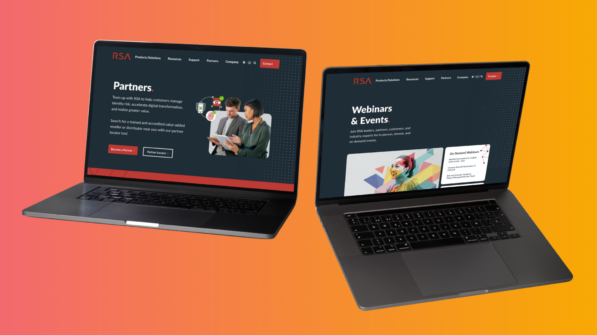
DESIGN CHALLENGE
Rebuild and redesign the core RSA.com experience to restore traffic, improve UX, and support a major product launch — all within 24 days before the RSA security convention.
RESPONSIBILTIES
Owned UX direction and UI design for the new website
Conducted site audit + analytics review with strategy team
Designed the content strategy & IA to restore SEO and user journeys
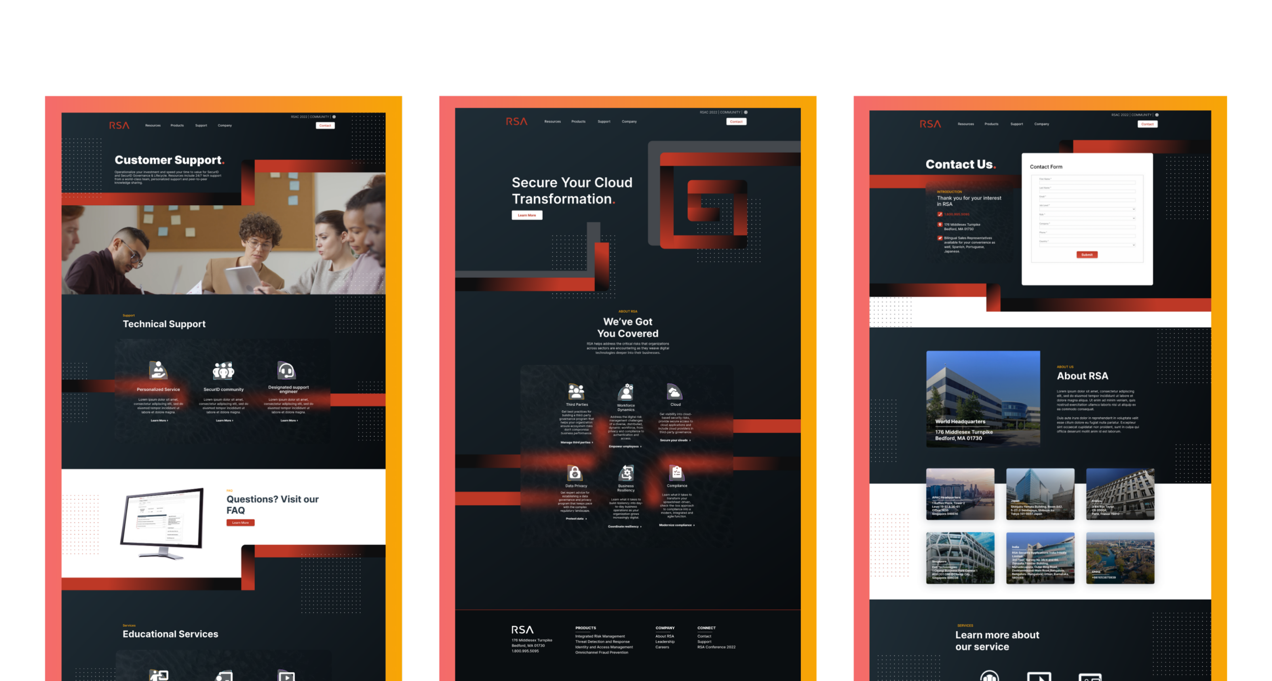
INITIAL DESIGN CONCEPT
Personal mockup of what the RSA redesign branding could look like before going in another direction with their internal designer.
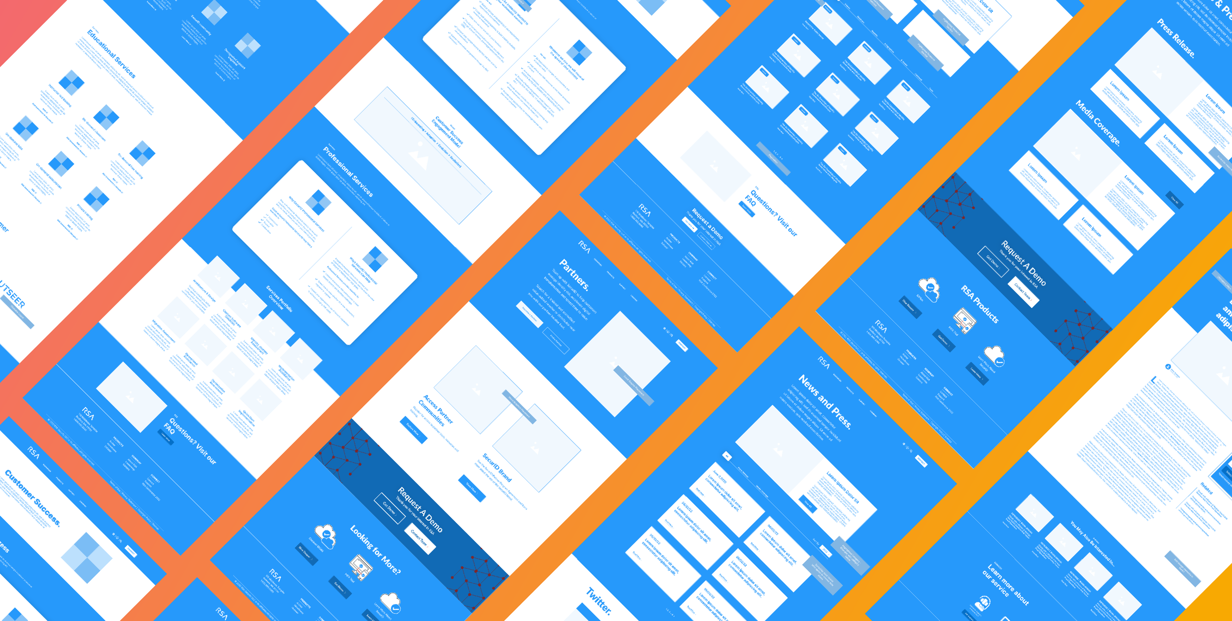
WIREFRAME
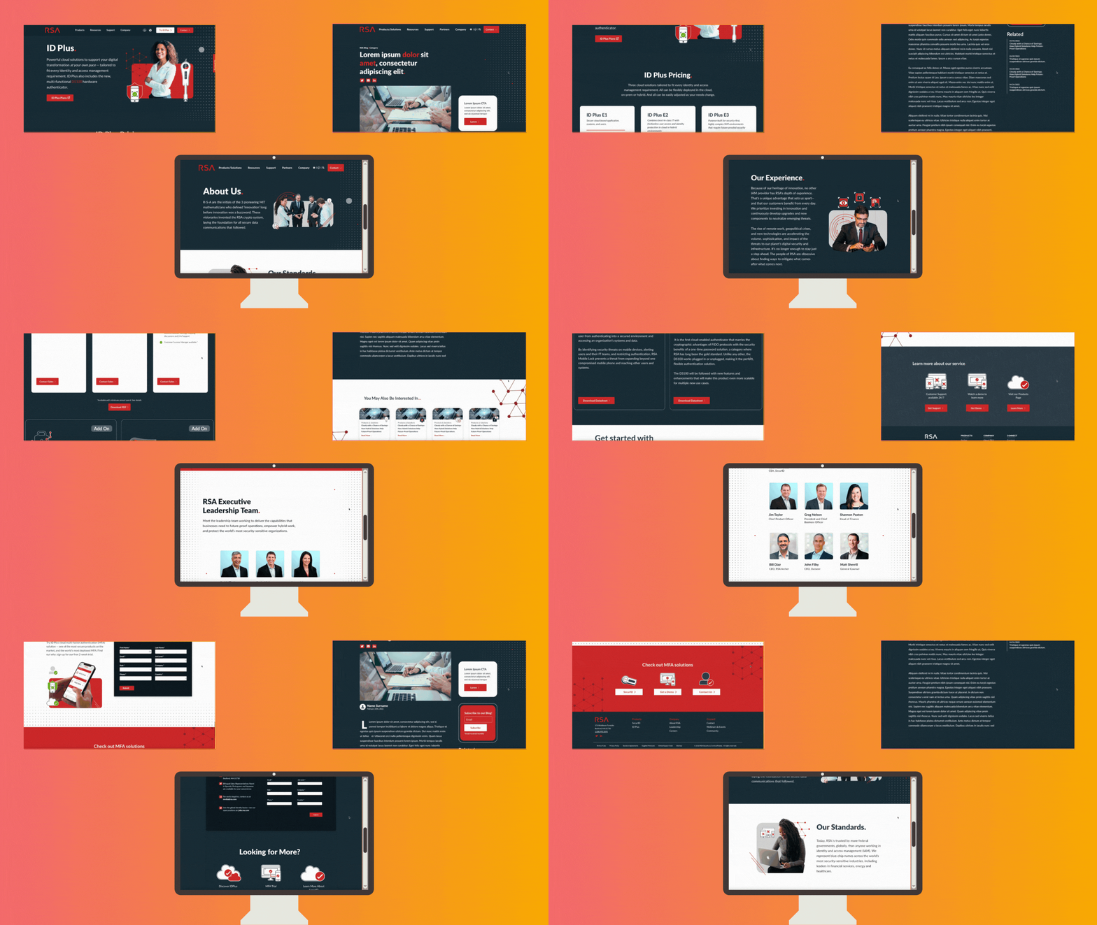
Low-fidelity sketches → mid-fidelity wireframes → component-based page templates.
Design priorities:
Clarify product value proposition quickly
Allow deeper exploration without overwhelming users
Rebuild trust through credibility elements (customers, awards, stats)
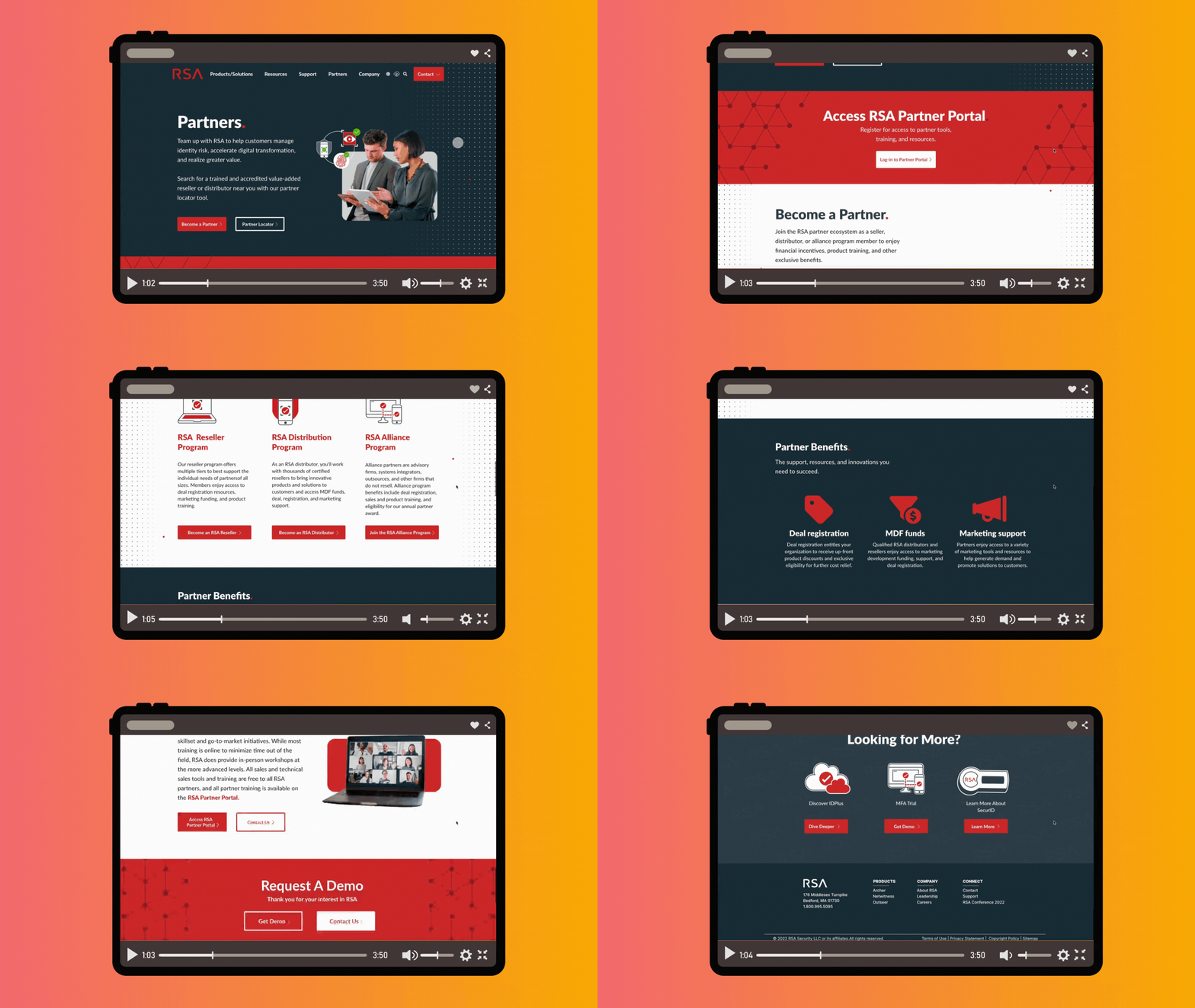
UI / VISUAL DESIGN ENHANCEMENTS
Created a modern visual language aligned with RSA’s brand and industry standards.
Designed a modular UI system that allowed the dev team to build pages rapidly.
Used security-driven imagery (safe, skeleton key, padlock montage) to reinforce product value.
Improved readability through balanced spacing, typography hierarchy, and contrast.
UX IMPROVEMENTS
Created streamlined user flows for product discovery, resources, and conversion actions.
Improved task completion rates by reintroducing structured content pathways.
Reduced friction by redesigning navigation for clarity and scannability.
Introduced consistent interaction patterns across all product pages.
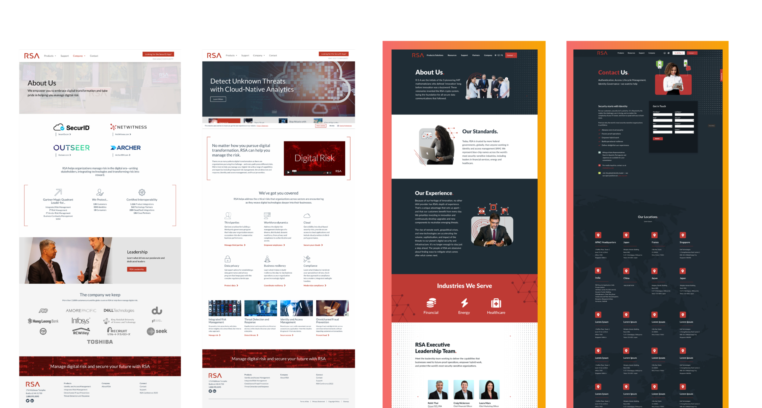
BEFORE
User Experience
Hub with 4 links and almost no content.
High bounce rate.
Lost SEO equity
Confusing product clarity
User Interface
Minimal, plain interface with underutilized whitespace
Inconsistent and outdated user interface patterns
Weak branding and lack of visual identity
AFTER
User Experience
Full content-rich digital experience.
Product exploration pathways.
Recovered traffic & improved organic ranking.
Clear offer, story, conversions.
User Interface
Introduced a modern dark theme for a more cohesive experience
Expanded and structured navigation for better discoverability
Established a stronger visual system with clear branding and color usage
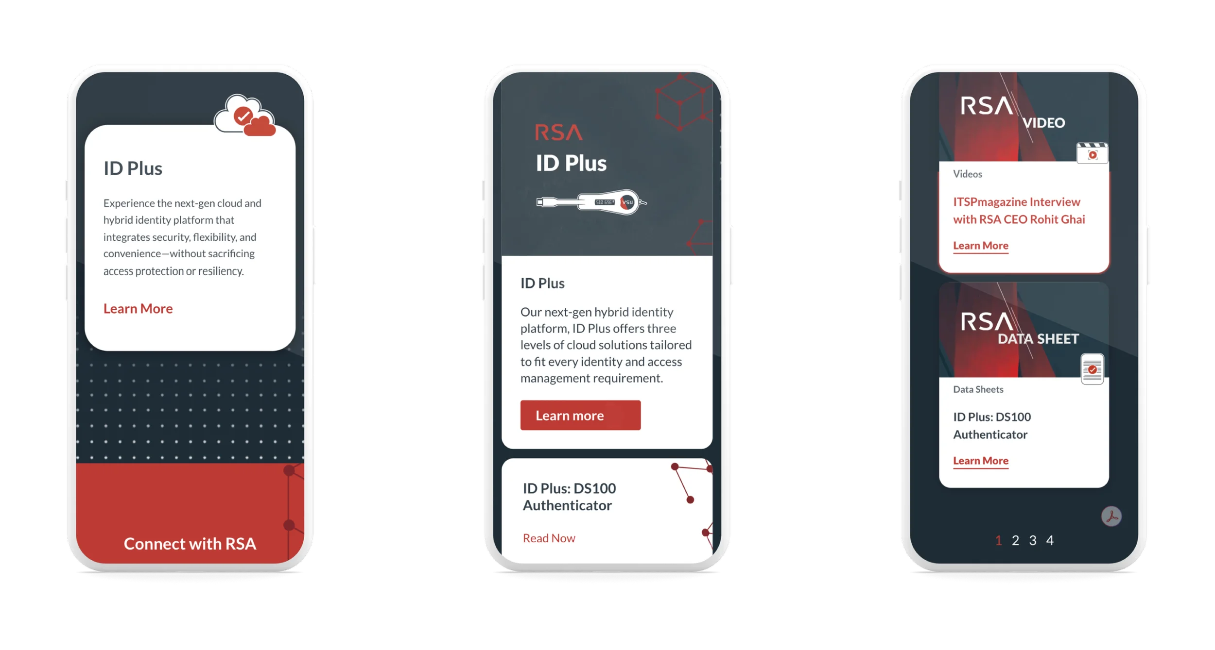
MOBILE DESIGN
WHAT I LEARNED
Even small redesign decisions can have massive SEO + business impact.
Design without analytics = guessing. Analytics + UX = strategy.
Large enterprise projects succeed when design and development work as one team.
WHY RSA CHOSE US
RSA selected our agency in large part because of the high-fidelity SecurID redesign I produced during the evaluation phase. While competitors shared concepts, we showed RSA what their digital experience could be. The polished wireframes demonstrated our UX vision and set us apart as the only team prepared to move straight into execution.