Signature Management Solutions: Website Redesign & Brand Refresh
DESIGN CHALLENGE
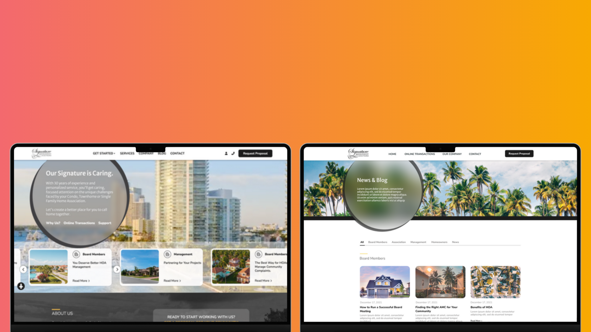
Signature Management needed a website that matched the professionalism and trust they provide as a real estate management company. Their existing site had valuable information, but it lacked structure, visual clarity, and a strong brand presence.
My role was to redesign their multi-page site with a cohesive brand identity, a more modern look, and a UX flow that made their services easier to understand and navigate.
MY ROLES
UX Designer
UI Designer
Brand Identity Direction
Site Architecture + Page Layout Systems
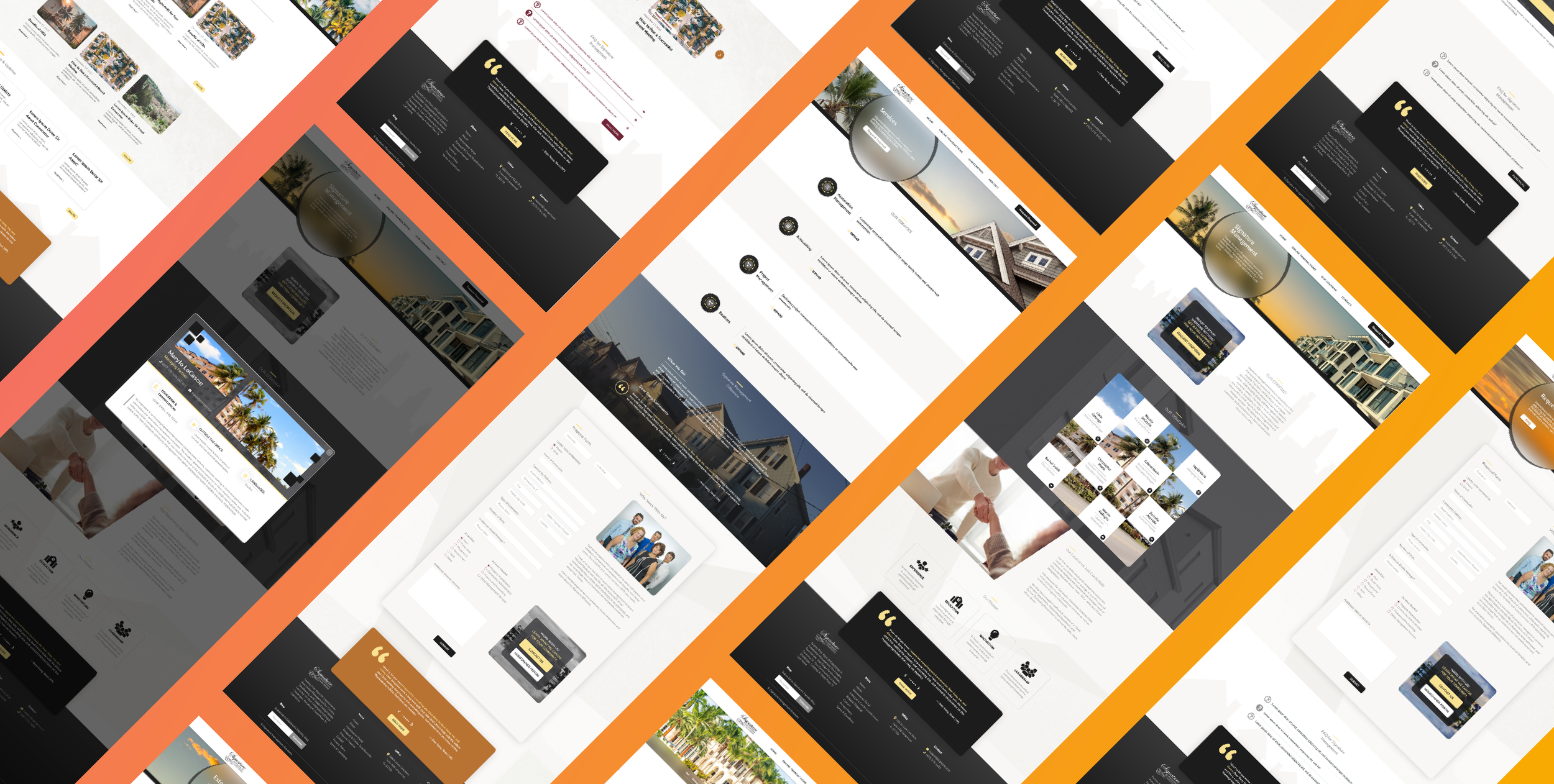
BRAND IDENTITY
Brand decisions I led:
A cleaner, more corporate color palette with modern tones
Updated typography for readability and hierarchy
New layout spacing rules to bring breathing room to each page
Visual elements that feel sharp, clean, and trustworthy
A more consistent brand experience across all pages
The goal was to bring a fresh, professional polish without losing the seriousness of their industry.

UX IMPROVEMENTS
Clearer Navigation Structure
Streamlined Information Architecture
Improved Content Flow & Readability
Stronger Calls to Action
More Accessible Layouts
Multi-Page Consistency
UI / VISUAL DESIGN ENHANCEMENTS
Modernized Color Palette
Updated Typography System
Improved Visual Hierarchy
Stronger Imagery & Visuals
Reusable UI Components
WHAT I LEARNED
Working on SIG Management taught me how powerful structure and consistency can be when designing large websites. I learned how to take a complicated, content-heavy site and turn it into something clean, modern, and easy to navigate. It also reminded me how important it is to refresh a brand just enough to elevate it — without losing the professionalism the client already built.