From Garage to Brand: Designing the Rise of Universal Hair Units
MY ROLE
UX/UI Designer
Logo Designer
Brand Visual Direction
THE CHALLENGE
Client needed a brand from the ground up — no existing website, no professional branding, and no structure for communicating his value online.
MY RESPONSIBILTIES
✅ Full brand identity creation
✅ Logo design exploration and refinement
✅ Website UX strategy and structural flow
✅ Website UI design and visual system
✅ Interaction patterns and responsive design
✅ Collaboration with content + development
UX DECISIONS
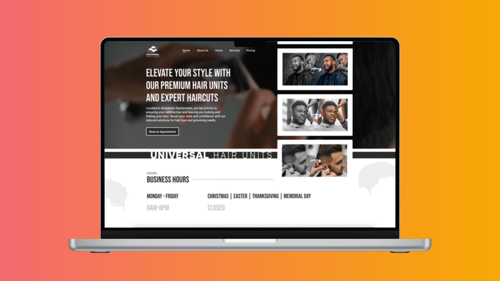
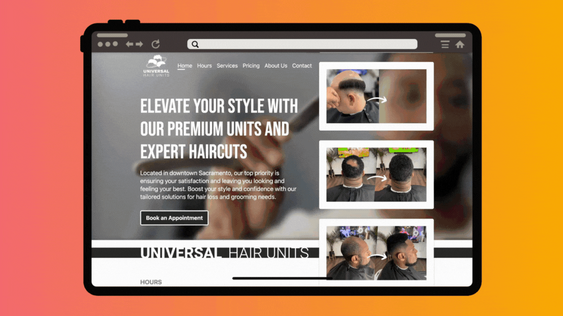
Long-Scroll Single-Page Experience
Reduced friction for first-time visitors
Made the experience mobile-first friendly
Avoided confusing navigation paths
Maintained attention on the brand narrative and transformation
UI DECISIONS
Look & Feel
Bold typography
Strong contrast
Clean spacing and grid-based structure
Dark, masculine aesthetic
Conversion-focused components
Key UI Elements
Large hero section with minimal distraction
Step-by-step transformations to build emotional trust
Sticky CTAs on mobile
Iconography to simplify explanations
Modular components that can expand with the brand
Logo
Universal Hair Units needed a logo that would become the visual anchor of the entire brand. Because the business serves a wide range of clients—with different hair types, textures, and transformation needs—I set out to design a mark that was inclusive, versatile, and recognizable across every brand touchpoint.
CREATING A VERSATILE MARK
A Logo That Would Work in Many Cases:
Website & mobile screens
Business cards and appointment materials
Product packaging
Apparel
Indoor signage
Outdoor advertising
FINAL IDENTITY
Final Logo Look & Feel
Inclusivity of multiple hair types
A modern, confident aesthetic
Clean, scalable geometry
A premium feel aligned with the growing business
The flexibility to work across digital, apparel, signage, and advertising
After Launch
One of the biggest validations of this design came after launch.
Because of its bold geometric form, the logo translated perfectly into a neon sign inside the Universal Hair Units studio, becoming a key visual centerpiece that clients immediately recognized.
Its strong silhouette also enabled the logo to scale up seamlessly for large outdoor billboards across Sacramento, further expanding the brand’s presence and elevating its reputation.
WHAT I LEARNED
Working on Universal Hair Units taught me how powerful simple, thoughtful design can be. I learned the importance of creating a brand that feels real to both the client and their customers. Seeing the logo I designed show up as a neon sign and on billboards reminded me to always design with future growth in mind—even if a project starts small. Overall, this project showed me how much impact good branding and clear UX can have on a business that’s growing fast.